

Case study
Making a complex market make sense
Repositioning and redesigning the website for a carbon markets company, so each audience can tell what Abatable does and find their route in seconds.
+54%
Contact form submissions after launch, with better-qualified leads
100+
Pages migrated from WordPress with no lost SEO
13 weeks
From first workshop to launch, in time for Climate Week
0
Developers needed: the marketing team now runs the site and builds pages for prospects on their own

“What sets Ethan apart is that he designs and builds at the same time, so nothing gets lost in translation between the two. And the support didn't stop at launch. It's genuinely the most white-glove experience we've had, to the point where it felt like he was part of our team, not a vendor who disappears once the site goes live.”
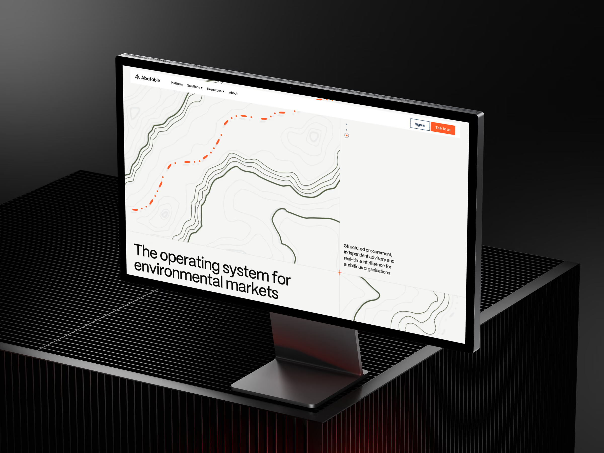
The new homepage on desktop
Overview
Abatable helps organisations buy environmental credits with integrity. They run structured procurement, give independent advisory, and publish market intelligence that much of the industry reads. They serve three quite different groups: companies buying credits, investors, and project developers.
The trouble was that almost nobody could describe what Abatable does. Some visitors assumed it was a software platform. Others filed it under consultancy. AI search engines were picking up the advisory side and missing the rest. Inside the company, people described the business differently depending on who you asked.
I was brought in to fix that from the ground up. That meant working out what Abatable is and how to say it, then designing a website where each audience can find its route quickly, and building it so the team could run it without a developer. The deadline was fixed: the site had to be live before Climate Week in June, when more of the market would be looking at Abatable than at any other point in the year.
- Client
- Abatable, environmental markets (procurement, advisory, market intelligence)
- My role
- Strategy, positioning, UX, UI, motion, Webflow build, post-launch support
- Timeline
- Feb – Jun 2026 (13 weeks, idea to launch)
- Team
- Me, working directly with Abatable's Senior Product Marketing Manager, GTM Director, Senior Content Manager, Product Design Lead and Brand Designer. A contractor supported copywriting.
- Deliverables
- Positioning and messaging, information architecture, visual identity extension, website design (desktop and mobile), motion prototypes, Webflow build, migration of 100+ pages
My role
I led the project end to end as the only designer and developer.
Strategy. I ran workshops with Abatable's team on positioning, messaging, ICP and long-term goals, and wrote the positioning and competitive research that came out of them.
UX. I rebuilt the site's navigation and information architecture around the new positioning, deciding which pages each audience needs and how they move between them.
UI and motion. I designed the interface for desktop and mobile, and prototyped states, transitions and micro-interactions in Figma so that motion was agreed before the build started.
Development. I built the site in Webflow as a system of reusable components, so the team can add or change pages without a developer.
Post-launch. I stayed on Slack for two weeks after handover while the team refined content.
Mobile navigation and pages
The challenge
The hardest problem wasn't visual. It was comprehension.
The old site didn't look bad. But its messaging was too abstract for experienced buyers and too technical for newcomers, and its structure made visitors click around to find anything relevant to them. On top of that, WordPress was slow, and the team had to go through developers for changes. They couldn't put together a page for a specific prospect at all.
Hard to explain. Abatable combines procurement, advisory and intelligence in one company. From outside it looked like either a platform or a consultancy, and it is neither of those alone.
A voluntary market. No one has to buy carbon credits. How do you seem essential in a market people can opt out of?
Three audiences, one site. Buyers, investors and developers each need different things, and they arrive at different levels of knowledge about the market.
A hard deadline. Climate Week in June could not move. The positioning, the design and the build all had to fit into 13 weeks.
Discovery
Getting the room to disagree
I ran discovery as working sessions with six people from across Abatable: go-to-market, content, product design, brand and the founding team. Each session followed a set agenda of questions, and I pushed back when answers stayed vague.
Group sessions matter because they show how differently people inside a team see their own company, even when everyone thinks they already agree. Some moments were uncomfortable, when the team struggled to explain parts of the offering. Those moments were the most useful part of discovery, because they pointed exactly to where the messaging needed work.
A few things the team said shaped the rest of the project:
“We have all the proof points and the experience to back it up. So why not lead with that a bit more?”
“The part of our business where we help companies purchase carbon credits… has been superseded by all of our intelligence work. It's not as well known as it should be.” — Senior Content Manager
“Not everyone that works in sustainability has a deep knowledge about the voluntary carbon market… we use more complex language that people knowledgeable about the market might get, but maybe not others.” — Product Design Lead
“We don't really have anything about tech or product on our website. It's being picked up on the advisory side.”
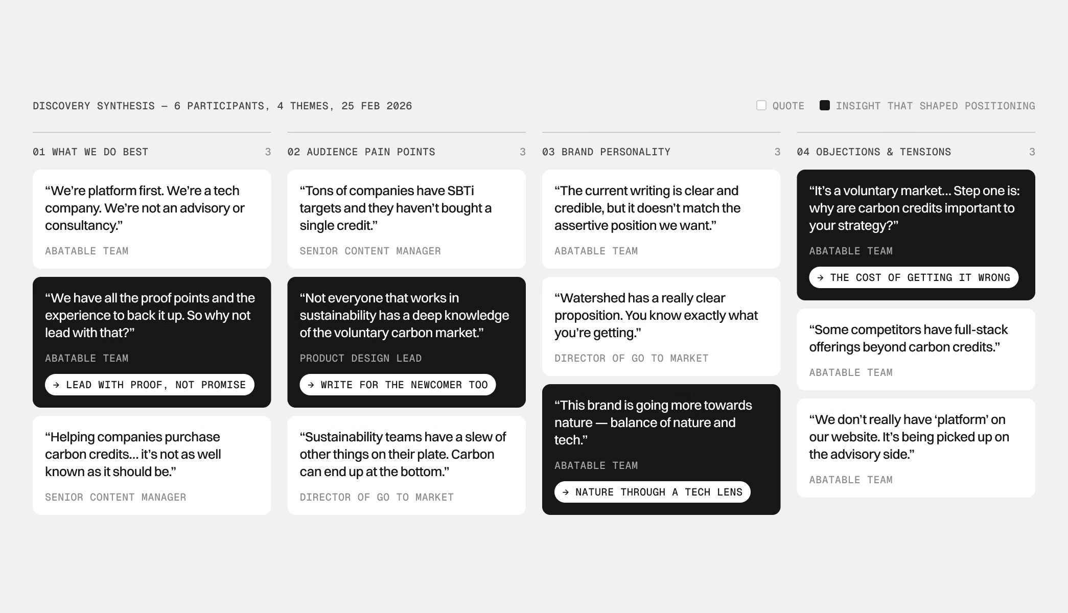
Discovery synthesis: 6 participants, 4 themes
Mapping the market
In parallel, I audited seven competitors, including Watershed, South Pole, Patch, Carbon Direct, Rubicon Carbon and 3Degrees. For each I looked at positioning, audience, tone of voice and how clear the website was.
The market had a trust problem. High-profile greenwashing scandals had made buyers more selective, not driven them away. The strongest positioning in the space (Watershed) was clear but broad. Specialist competitors were either marketplaces or consultancies. No one owned the combination of deep carbon expertise, technology and integrity-first positioning. That gap was Abatable's to take.
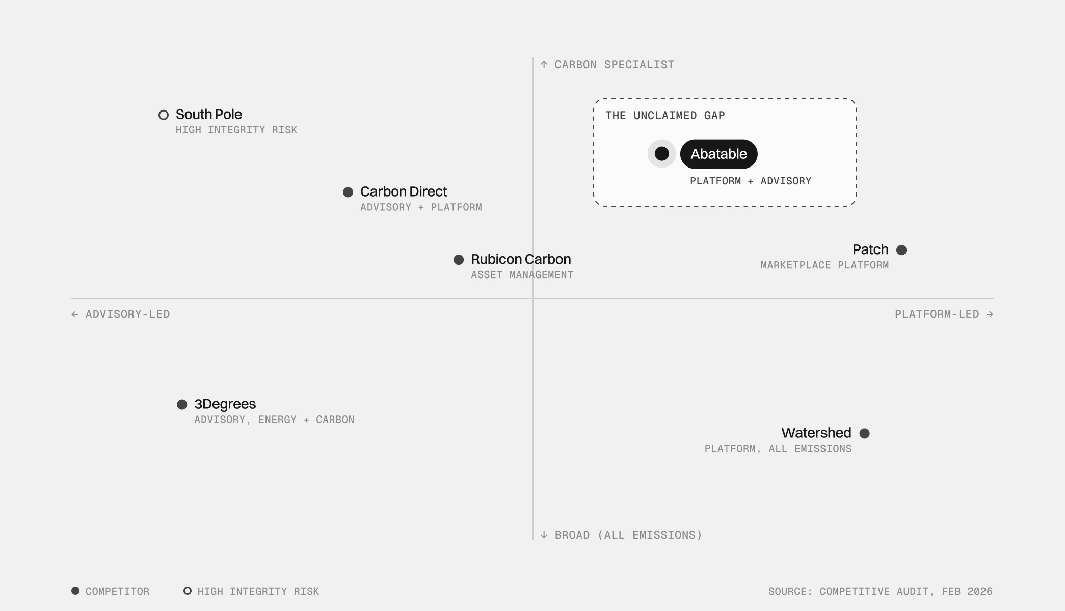
Competitive positioning: the unclaimed gap
Positioning
Naming the tensions before resolving them
Instead of going straight to a tagline, I wrote down the four tensions that made Abatable hard to position. I framed them as choices the team had to make, not problems that would go away.
1. Voluntary vs. indispensable. Participation is optional. Getting it wrong is not. This moves the question from “should you engage?” to “will your strategy hold up under scrutiny?”
2. Educating the market vs. converting buyers. Lead with conversion for buyers already in the market, or about to enter it. Education moves into content.
3. Nature brand vs. tech company. Show nature through a technology lens, using data, precision and topography, rather than conservation-poster imagery.
4. Cautious expert vs. confident guide. Lead with evidence, not promises. Write in declarative sentences, not hedged ones.
These choices went into a new value proposition and a tone of voice that the rest of the project was built on.
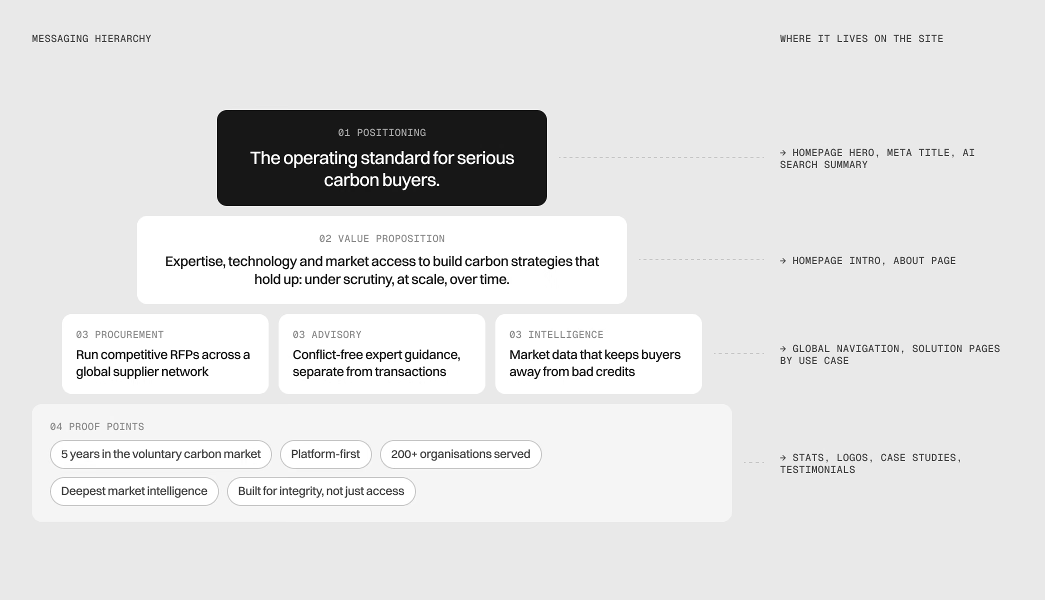
Messaging hierarchy, and where each level lives on the site
Visual direction
Changing my process to fit the team
I started with two moodboards based on Abatable's references and what we learned from their brand designer. The team struggled with them. Other brands' work didn't help them picture their own brand.
So I changed approach straight away and designed a set of real website sections in each direction, using Abatable's own content. That worked. Once the team could see their brand in context, the decision moved quickly.
The final direction puts the positioning into practice: nature seen through a precision lens. We extended the existing identity with new textures and applications so it works on social, the newsletter and other marketing channels as well as the website.
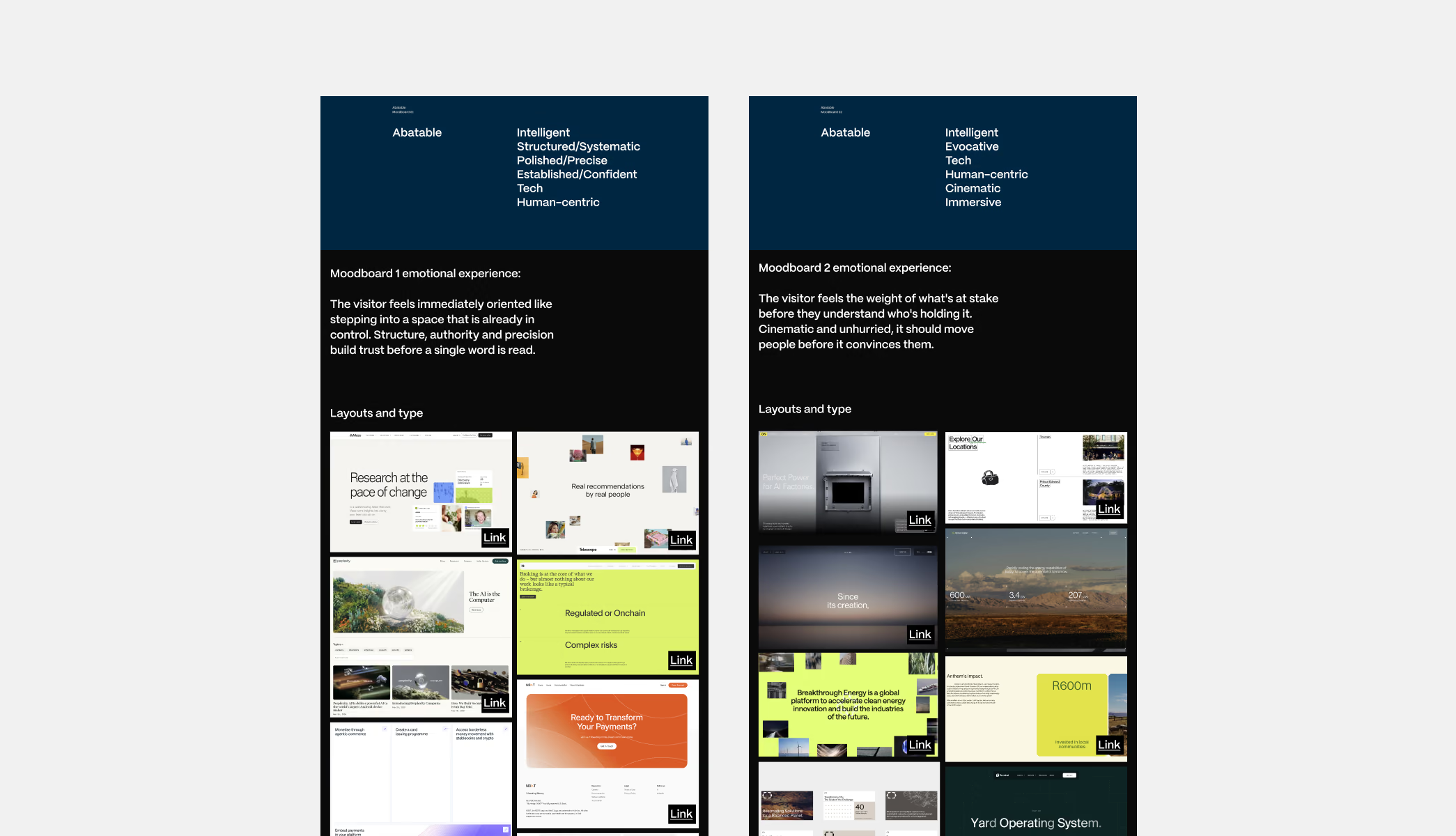
The two moodboards
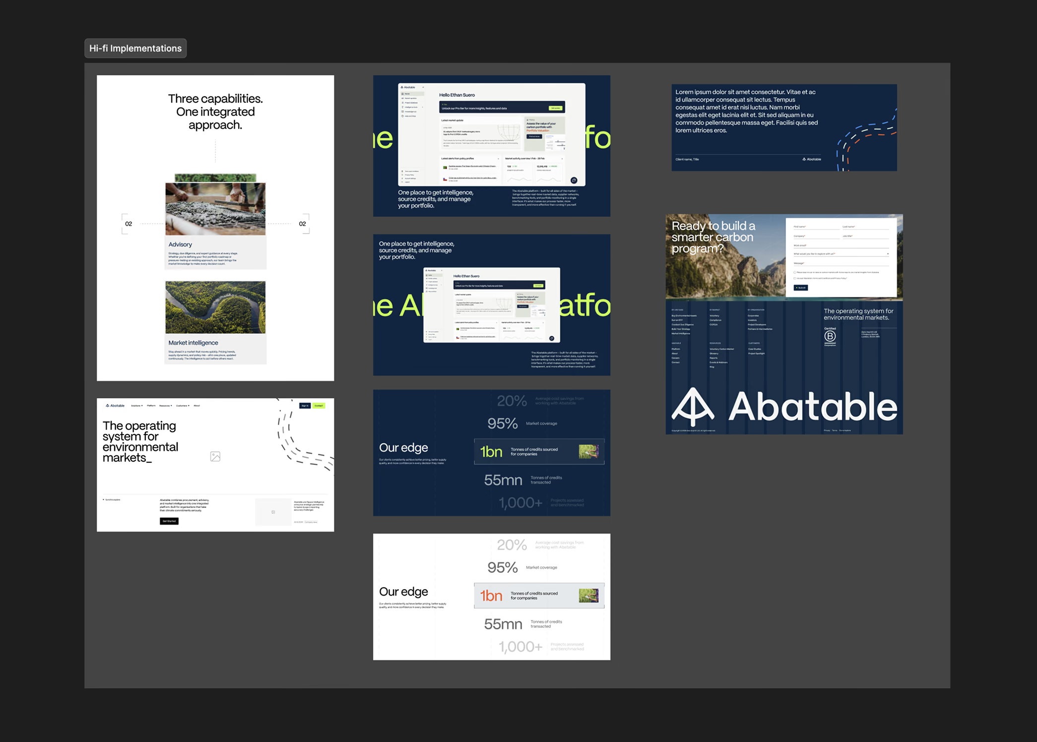
Creative direction: real sections in each direction, after the moodboards
Information architecture
Three ways in, one clear structure
The new offering meant the site needed new pages. The old site had around eight solution pages in no clear grouping. I brought them together under three lenses that match how different visitors think about their problem:
By use case. Run an RFP, build your strategy, conduct due diligence, get market intelligence, access demand.
By market. Voluntary carbon market, CORSIA.
By organisation. Buyers, investors, developers.
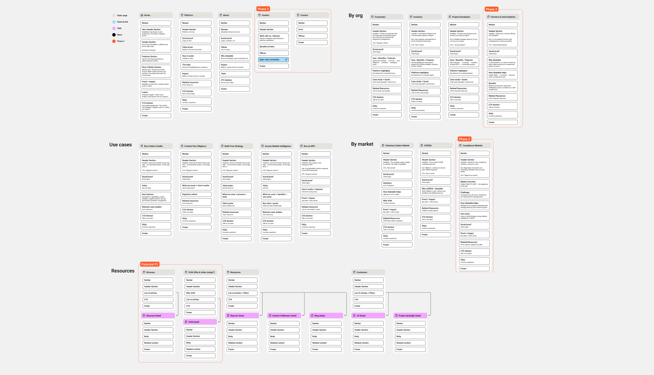
The new sitemap: by use case, organisation and market
The grouping came partly from the data. Procurement was already one of the site's most-visited pages and sat naturally under “use case.” Extending that logic into a small set of groups, rather than adding a new category for every page, let us keep most existing URLs intact. That protected the traffic the site already had and meant only 58 redirects were needed across 100+ pages.
A new global navigation brings all three lenses up front. A buyer, an investor and a developer can each find their route from the first screen, without the clicking around the old site required.
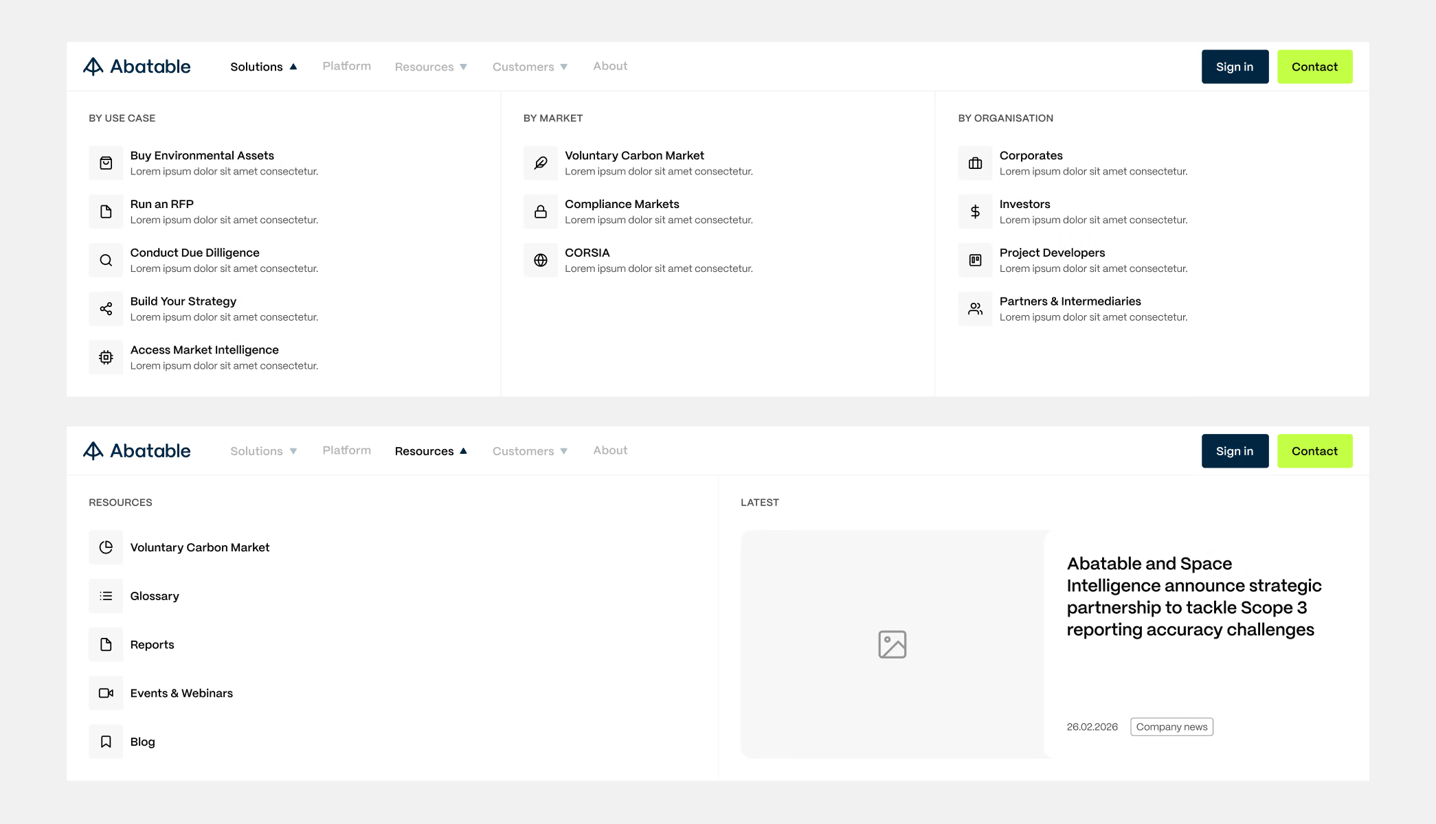
Global navigation: the Solutions and Resources mega menus
Trade-off: static pages over a CMS template
A CMS template would normally be the right choice for solution pages, because it's faster to publish and more consistent. But each solution page speaks to a different audience with a different argument, so one template would have forced every page into the same shape. Abatable also wanted full control over these pages.
I built them as static pages from a shared library of components. The team loses a little speed compared with a template, but each page can be structured around what its audience actually needs.
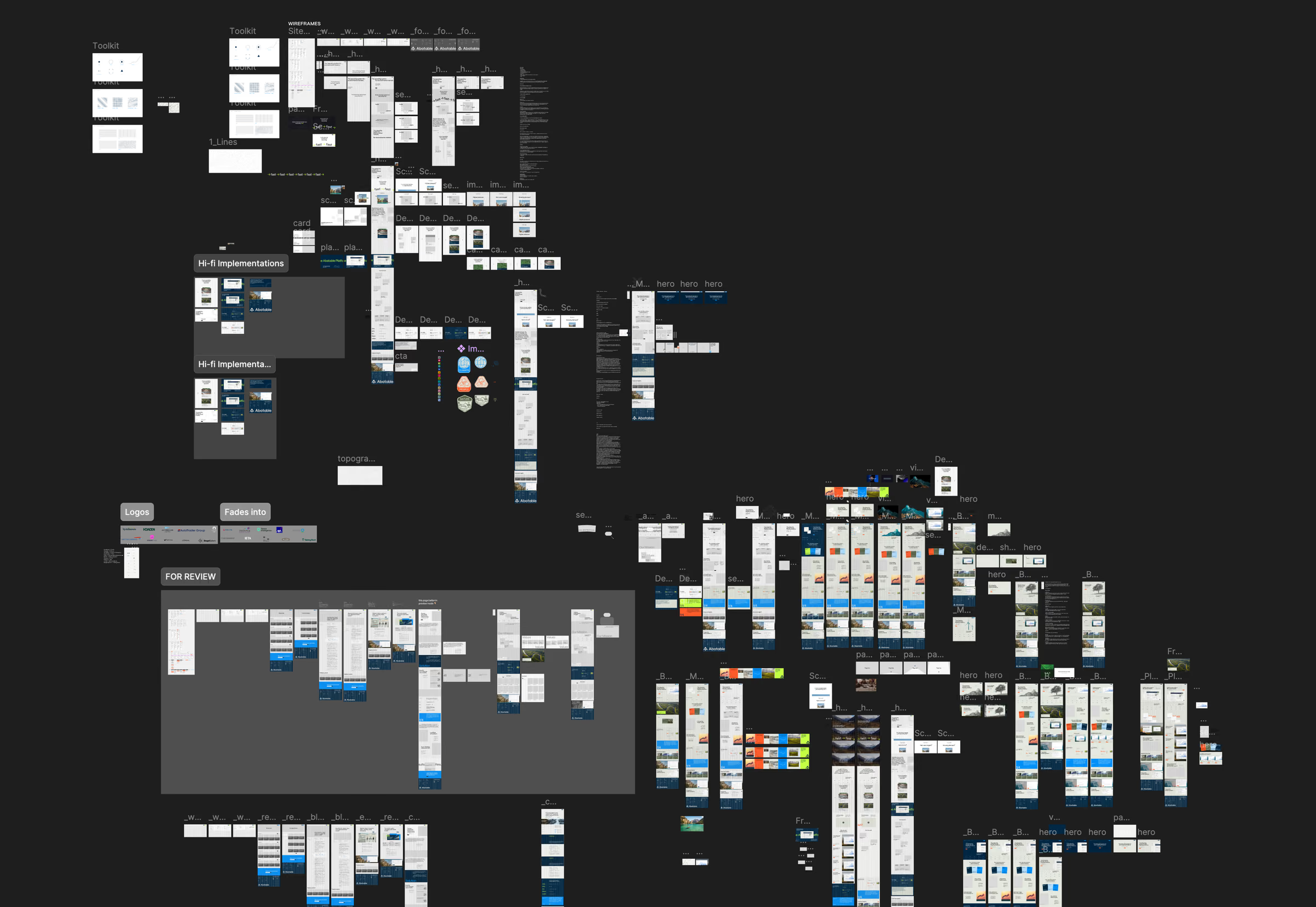
The project canvas in Figma, from wireframes to hi-fi explorations
Prototyping motion before building it
For hover states, transitions and micro-interactions, I prototyped the motion in Figma for desktop and mobile. That meant the team approved how the site feels, not only how it looks, before I built anything. It also meant nothing got lost between design and build.
Motion prototype in Figma: the solution cards
Key design decisions
1. The homepage hero, which we settled almost last
The hero stayed open for most of the project, and for a good reason. The positioning workshops had exposed the messaging problem, and Abatable was working through it internally, exploring different directions for the business. The hero had to wait for those answers.
We explored three routes:
Static image with a strong headline. Clear, but it didn't convey how broad the offering is.
A narrative homepage with scroll-driven video or an image sequence. Engaging, but long, and it pulled attention away from the message.
Final: textures with a direct statement of what Abatable does and who it's for. This version had fewer distractions and a shorter scroll.
The final hero does the one job the old site failed at: it tells a visitor what Abatable is within seconds.
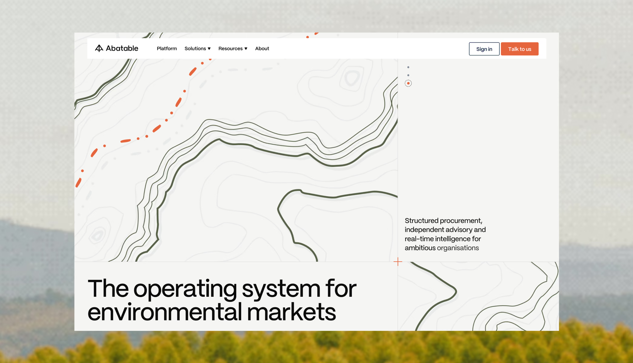
Final design: the homepage hero
2. Balancing content against attention
Abatable has a lot of expertise and wanted to show all of it. In places the copy was simply too long, which broke layouts and made pages long enough that most visitors would leave. I pushed back section by section to find the right balance, keeping depth where it earns trust and cutting where it only adds scroll.
3. Designing for the people who run the site
The marketing team uses the site as much as visitors do. Every section is a reusable component that can be rearranged, so the team can build a new page, or a page for a single prospect, in minutes. Before, that wasn't possible at all.
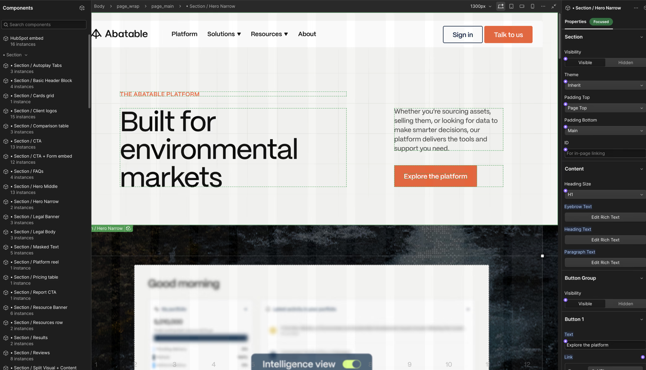
The component library in Webflow
Launch and handover
The site went live in mid-June, ahead of Climate Week.
Handover didn't end at launch. For two weeks after the site moved over, the team refined content and made small edits with me on Slack to answer questions or fix issues quickly. The team said this was the part they valued most, because it took the stress out of their first weeks running a new site.
Final design: the site loader
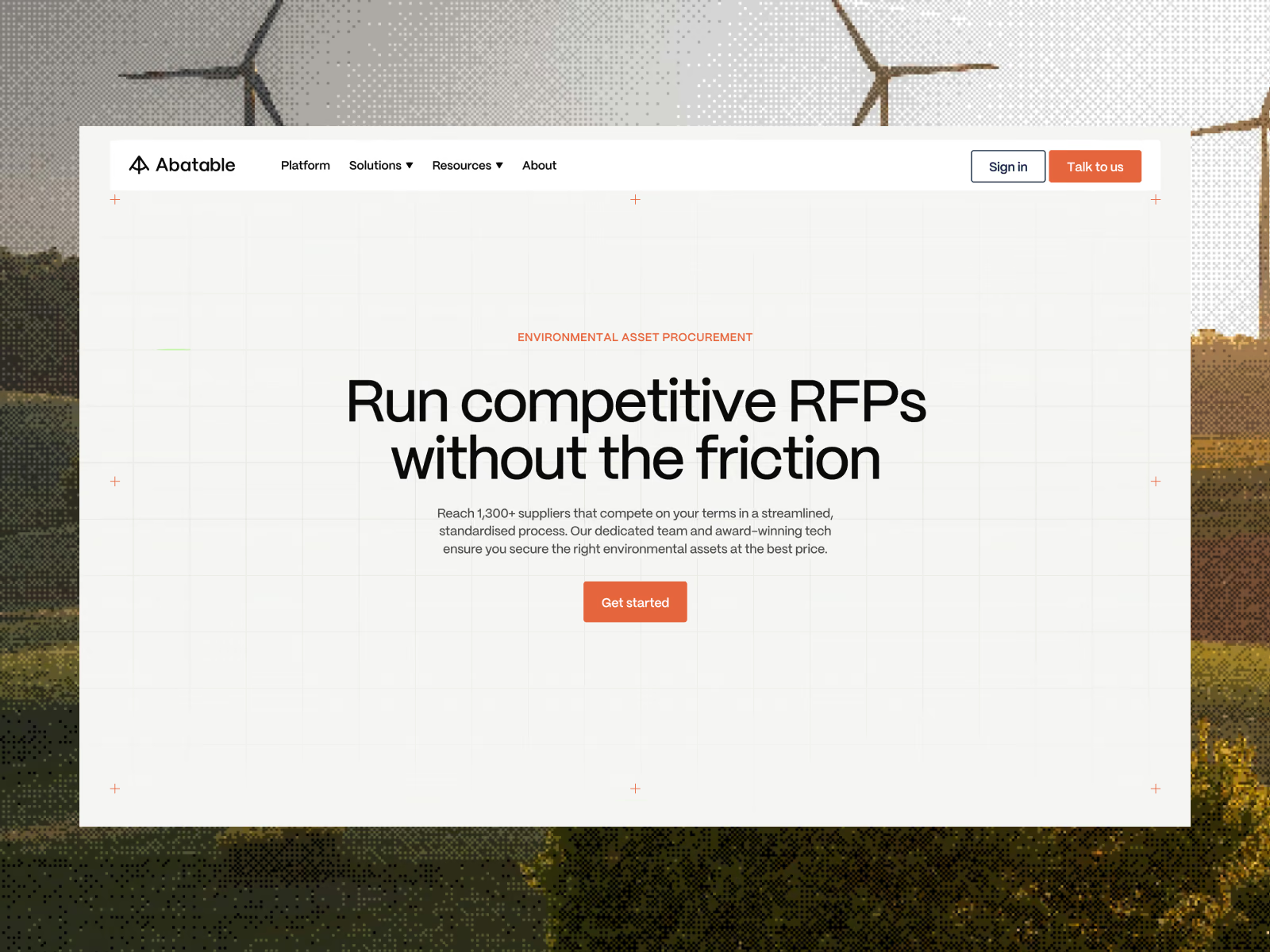
Final design: a solution page, Run an RFP
Final design: page transitions
Final design: the mega menus in motion
Final design: a scroll-driven split section
Final design: the animated metrics
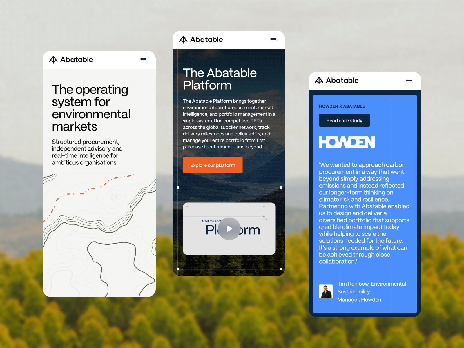
Final design: homepage, platform and case study on mobile
Outcomes
+54% contact form submissions, and the team reports that leads are better qualified than before.
The marketing team owns the site. WordPress and developer dependency used to block them. Now they publish, edit and build prospect pages on their own.
A clearer story for the market, with one structure that works for buyers, investors and developers alike.
A visual system beyond the website, extended across social, the newsletter and other channels.
Note: headline traffic isn't directly comparable. The old site tracked every visitor, while the new one only tracks visitors who consent to cookies.
Reflection
Adapt the process to the team, not the other way around. The moodboards cost time because I assumed they would work the way they usually do. Now I check early how a client makes decisions, and I adjust the parts of my process that face the client while keeping the parts that do the heavy lifting.
Structure is what makes content work. The biggest gains didn't come from copy or visuals alone. They came from giving each audience a clear route into the site. When the content is complex and the audiences vary, information architecture is what turns a website into something people can use, and the leads showed it.